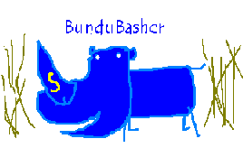
Stop the presses! Thump, contrary to popular brainwashing, is NOT the only gifted graphic artist at DRN!!! There is a dirty conspiracy going on here in our own backyard. Case in point- Several months ago (during a temporary bout of insanity when I may or may not have started a flame about avatars, I dunno - my memory of that is a little fuzzy) I spent countless hours working on a custom avatar for Alan (BunduBasher). What happened, Thump? Your dog ate it? Skeered of a little competition? You just watch your back, mister. I got a glass jaw that could easily cut your fist and cause a nasty infection. Plus I have a weak bladder, and am likely to mess the ground around my feet.
This site uses cookies to help personalise content, tailor your experience and to keep you logged in if you register.
By continuing to use this site, you are consenting to our use of cookies.