Alright Peeps, Explain your PP
- Thread starter r0yal
- Start date
You are using an out of date browser. It may not display this or other websites correctly.
You should upgrade or use an alternative browser.
You should upgrade or use an alternative browser.
The very basic approach for me since my Photoshop skills are sub par at best goes something like this:
After opening photo in photoshop I start with auto levels, 98% of the time that looks good so I keep it the other 2% of the time I delete. Next comes auto contrast. Then it's a toss up of a little play with the shadows/highlights slider and some added saturation. Then a little sharpening.
That's pretty much it for me on most images, but like I said my photoshop skills suck. My off season resolution last year was to increase my photoshop skills but apparently I'm even worse at resolutions than I am at photoshop :laugh:
- May 23, 2000
- 1,386
- 0
Someone else mentioned the "digital velvia" approach in a different thread. I'd recommend googling digital velvia and see what you can find. I found a great site that showed you how to create an action in Photoshop that will duplicate the look. It's nice because it doesn't cost anything but it looks great!
I just grabbed a random shot from my drive to show you. The original is the raw shot with nothing tweaked. The second shot has only had the digital velvia action added to it. Once you get the action set in Photoshop it takes about a second to click the Play button and apply it to any photo. I've got it set so that it automatically makes a copy of the original so you've always got the true raw image on file. You'd still probably need to do some sharpening and other mild tweaking, but this action gets you pretty close and brings out the colors very nicely.
I just grabbed a random shot from my drive to show you. The original is the raw shot with nothing tweaked. The second shot has only had the digital velvia action added to it. Once you get the action set in Photoshop it takes about a second to click the Play button and apply it to any photo. I've got it set so that it automatically makes a copy of the original so you've always got the true raw image on file. You'd still probably need to do some sharpening and other mild tweaking, but this action gets you pretty close and brings out the colors very nicely.
Attachments
Last edited:
- May 23, 2000
- 1,386
- 0
It is a very gradual difference between the two. With the Photoshop action you can control the intensity of the change you make to the color and I used my very basic version, so not tons of change. It probably wasn't the best image to use either. It just happened to be the random shot that I opened. I wish I knew how to post side by side too!
This shot might give you a little better idea. The first is the raw image right out of the camera (no tweaking done). The second is with a more aggressive digital velvia setting. It's a little overdone with the oranges, but it gives a better idea of how easily you can pump colors up for better contrast and saturation.
This shot might give you a little better idea. The first is the raw image right out of the camera (no tweaking done). The second is with a more aggressive digital velvia setting. It's a little overdone with the oranges, but it gives a better idea of how easily you can pump colors up for better contrast and saturation.
Attachments
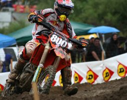
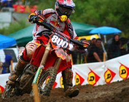
Ok I'll try to show some examples with a shot I took this weekend.
Shot # 1 - Straight out of the camera not touched in any way other than to resize for this webposting. Don't let the name raw.jpg fool you this was shot as a large fine jpeg.

Shot # 2 - Same shot now processed how I would normally process it to print for customer. steps were Auto Levels, Auto Contrast, Increase Saturation +3, Sharpen then resize for web.

Shot # 3 - Photoshopped as follows; Auto Levels, Auto Contrast, Digital Velvia @ 10%, Sharpen then resize for web.

I then tried Digital Velvia at 20% but the riders face was getting too red for my liking. If you would like to compare them side by side feel free to use save as and download them from my site. Then if you don't have a viewing software that allows you to compare multiple images try Fast Stone Image Viewer. Fast stone was what I was using for all my image browsing until I switched to Photo Mechanic recently.
Shot # 1 - Straight out of the camera not touched in any way other than to resize for this webposting. Don't let the name raw.jpg fool you this was shot as a large fine jpeg.
Shot # 2 - Same shot now processed how I would normally process it to print for customer. steps were Auto Levels, Auto Contrast, Increase Saturation +3, Sharpen then resize for web.

Shot # 3 - Photoshopped as follows; Auto Levels, Auto Contrast, Digital Velvia @ 10%, Sharpen then resize for web.

I then tried Digital Velvia at 20% but the riders face was getting too red for my liking. If you would like to compare them side by side feel free to use save as and download them from my site. Then if you don't have a viewing software that allows you to compare multiple images try Fast Stone Image Viewer. Fast stone was what I was using for all my image browsing until I switched to Photo Mechanic recently.
r0yal said:is that Digital Velvia free ?
Lots of places that sell the Digital Velvia action, however it's easy enough to make your own. Follow the directions on this page http://www.reflectiveimages.com/digitalvelvia.htm . Where it get's you to change the color values to 120 that is the 20% action, create similar actions for 110, 130 etc to give you the different effects.
Similar Topics
FRESH VIDEO
-
“I Wanted To Rip Him OFF His Bike!” | Ivan Tedesco on the SML Show
Tue, 18 Feb 2025 03:06:30 CST
-
PulpMX Show 615 – Levi Kitchen, Cooper Webb, Nicoletti, Brough w/ Keefer & Gregg Albertson in Studio
Tue, 18 Feb 2025 00:19:32 CST
-
This Rule Changed! Does it Need Changing Again? | Lewis vs. Kellen: More Than Moto Ep. 47
Mon, 17 Feb 2025 18:27:44 CST
-
Weege Show: AMA Rulebook on Restarts and More from Detroit
Sat, 15 Feb 2025 19:55:21 CST
-
Finding Speed with Smooth Riding Technique!
Fri, 14 Feb 2025 15:00:27 CST
-
Fly Racing Moto:60 Show – Detroit SX 2025 with Dan Truman & Zach Osborne
Thu, 13 Feb 2025 14:12:38 CST
-
The Reeds Go to Tampa Supercross!!
Tue, 11 Feb 2025 16:56:07 CST
-
Deserving of a Factory Fill-In Ride? | Hunter Yoder on the SML Show
Tue, 11 Feb 2025 13:00:33 CST
-
Is Malcolm Stewart About to Take Off? | Lewis vs. Kellen: More Than Moto Ep. 45
Mon, 10 Feb 2025 16:17:37 CST
-
PulpMX Show 614 – Malcolm Stewart, Max Anstie, Cianciarulo, Nicoletti w/ Lewis Phillips in Studio
Sun, 09 Feb 2025 18:26:57 CST


