Bottles and light
- Thread starter Okiewan
- Start date
You are using an out of date browser. It may not display this or other websites correctly.
You should upgrade or use an alternative browser.
You should upgrade or use an alternative browser.
- Aug 2, 2000
- 13,504
- 19
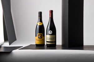
Mind you, my artistic eye is just about as honed as my musical ear (what's the visual equivalent to "tone deaf"?), but two things (a plus and a minus)
on the plus side, the lighting and shadow is "dramatic" and gives me a visceral feeling that says "hey, this wine is for the hoi-polloi and if I want to be cool I have to drink it too!"
On the minus side, I can't tell the brand name, so I don't know what kind of wine I have to buy to be cool.
on the plus side, the lighting and shadow is "dramatic" and gives me a visceral feeling that says "hey, this wine is for the hoi-polloi and if I want to be cool I have to drink it too!"
On the minus side, I can't tell the brand name, so I don't know what kind of wine I have to buy to be cool.
- May 23, 2000
- 1,386
- 0
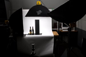
It looks like you're off to a great start. My only suggestion would be maybe a little bit more fill light on the front. I dig the subtractive lighting on the right, but just a touch more light in there would even out the labels the slightest bit while still keeping the cool reflections on the left side. Maybe a small reflector or some foamcore just to the right of the camera to bounce a little bit back in there without it getting too specular?
- May 23, 2000
- 1,386
- 0
Okiewan said:Both good points .... will work it up with a fill card on camera right. One thing making it difficult is the "gold" text on the right bottle ... :(
Thank goodness for Photoshop! :)
- Thread starter
- #7
Yup.Kawidude said:Thank goodness for Photoshop! :)
Squid, the controlled reflection is REALLY hard to get right when going across the label (tends to wash it out), also tends to take some of the roundness out of the bottle, which leads to:
The fill card adds another white almost full reflection on the right side, which I really don't want (2 reflections) I tried MANY options, ALL of them show up to one degree or another.... so;
(to contradict myself), we'll use two exposures in raw, one for the bottle, one for the labels and run with it.
Glass is challenging! Thanks for the input all!
- Thread starter
- #8
I'll post the normal/tighter crop tomorrow, see if that makes the names more obvious.On the minus side, I can't tell the brand name
oldguy
Always Broken
- Dec 26, 1999
- 9,411
- 0
I was also thinking the shadows make it dramatic but the sharp shadow line right down the center makes the labels dissapear to my aged eye. The slight fill in front may relieve this enough.
Next we know Okie will post the true proportions showing that the bottles are really 20 foot tall silos in keeping with his theme from the SUV shot the other day
Next we know Okie will post the true proportions showing that the bottles are really 20 foot tall silos in keeping with his theme from the SUV shot the other day
Similar Topics
- Replies
- 9
- Views
- 1K
N
- Replies
- 0
- Views
- 211
N
FRESH VIDEO
-
Tate Reed is Back on the Bike!
Sat, 16 Nov 2024 13:00:03 CST
-
Going Back to Our Roots! Tate Reed Injury Update
Wed, 13 Nov 2024 16:43:22 CST
-
Cooper Webb on Offseason Racing, Choosing Fly, 2025 Expectations & More
Tue, 12 Nov 2024 14:00:06 CST
-
Recalling McGrath & Stewart Days… | Brian “Big B” Barnhart & Tim Ferry on the SML Show
Tue, 12 Nov 2024 13:00:17 CST
-
PulpMX Show 605 – Cooper Webb, Mitchell Oldenburg & Michael Leib w/ Blair, JT & Armsby in Studio
Mon, 11 Nov 2024 09:56:58 CST
-
Supercross Racing ON THE BEACH??
Thu, 07 Nov 2024 15:00:26 CST
-
Team Announcements are Rolling In | Lewis vs. Kellen: More Than Moto Ep. 36
Thu, 07 Nov 2024 10:20:25 CST
-
Fly Signs Webb! JT on How Deal Came Together, Explains How Gear Companies Budget Pro Riders
Tue, 05 Nov 2024 15:44:32 CST
-
Insight on Testing for Jett Lawrence & HRC Honda… | Trey Canard on the SML Show
Tue, 05 Nov 2024 13:00:19 CST

