Need some help
- Thread starter Thump
- Start date
- Status
- Not open for further replies.
I voted for #1 but are ya sure you couldn't squeeze "Spodefest" in there someplace?:)
Maybe make it a subliminal thing.
Maybe make it a subliminal thing.
I still like #1 :cool:
It's simple and not too busy. (kinda like me:confused: )
It's simple and not too busy. (kinda like me:confused: )
B
biglou
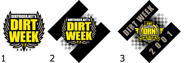
Number three!
My previous comments on the current logo not withstanding, it seems to make the most sense because it incorporates the current DRN logo. That said, they all look pretty good. I like them 3, 2, 1, in that order.
My previous comments on the current logo not withstanding, it seems to make the most sense because it incorporates the current DRN logo. That said, they all look pretty good. I like them 3, 2, 1, in that order.
- Sep 9, 2000
- 2,987
- 0
I like #2, I already have the DRN logo plastered on everything as it is. :eek: So something different is what i like. :confused:
I do like the checkered background, but maybe some other design besides a diamond if going with #2. The diamond looks fine with # 3 being it has text in it. Well enough said before i get booted. ;) Looks good Thump!
I do like the checkered background, but maybe some other design besides a diamond if going with #2. The diamond looks fine with # 3 being it has text in it. Well enough said before i get booted. ;) Looks good Thump!
#3
More eye catching/pleasing
besides that, its damn fancy!
More eye catching/pleasing
besides that, its damn fancy!
singletracker500
LIFETIME SPONSOR
- Jul 24, 1999
- 482
- 0
#3, if it wasn't tilted up at an angle. So I was left with no other choice than to vote for a "Hate um all, start over" Sorry.:(
- Jun 7, 2000
- 450
- 4
I am one of the "I hate 'em all" guy's.
Number 1 would probably be OK if the .net wasn't "plural" and the 2001 was larger. Then again #3 wouldn't be too bad if it wasn't angled. Either way ... # 2 is most definately the worst.
Just my .02
wrench
Number 1 would probably be OK if the .net wasn't "plural" and the 2001 was larger. Then again #3 wouldn't be too bad if it wasn't angled. Either way ... # 2 is most definately the worst.
Just my .02
wrench
:think
Perhaps you could Thump us out a no-tilt tres?
Sounds like a winner to me.
Perhaps you could Thump us out a no-tilt tres?
Sounds like a winner to me.
singletracker500
LIFETIME SPONSOR
- Jul 24, 1999
- 482
- 0
Originally posted by Okiewan
Humm... maybe number 3 or 2 not at an angle? Would make a pretty cool flag :)
Now we're getting somewhere.:) If you took the tilt out of #3, lenghtened it, and put the DRN logo on the left, you would have one great looking flag!
Jeff Allen
LIFETIME SPONSOR
- Sep 23, 1999
- 475
- 0
#3 works for me, ditto on the flag also.
- Nov 22, 2000
- 4,392
- 0
My 2 pfennigs
# 3-- s'il vous plait!
# 3-- s'il vous plait!

- Status
- Not open for further replies.
Similar Topics
- Replies
- 0
- Views
- 844
- Replies
- 30
- Views
- 8K

- Replies
- 4
- Views
- 1K
- Replies
- 3
- Views
- 1K
FRESH VIDEO
-
PulpMX Show 632 – Michael Mosiman, Alex Martin, Dylan Wright, Phil Nicoletti w/ Darkside in Studio
Sun, 06 Jul 2025 23:17:31 CDT
-
Weege Show: RedBud Wrap with Sexton, Vialle, Trials Demo & More
Sat, 05 Jul 2025 21:03:57 CDT
-
Weege Show: Sexton Chat, RedBud Mega Preview, Failed Sound Test and More
Fri, 04 Jul 2025 16:27:26 CDT
-
Antonio Cairoli to Debut Ducati in AMA Pro Motocross at RedBud
Fri, 04 Jul 2025 11:00:55 CDT
-
Kiah Reed’s First Ride Back!
Thu, 03 Jul 2025 19:32:56 CDT
-
A Big Weekend at RedBud Awaits | The Blair Matthes Project 023
Thu, 03 Jul 2025 11:01:30 CDT
-
Fly Racing Moto:60 Show – REEDDD BUUUDDDDDDD MX 2025 with Zach Osborne & Lewis Phillips
Wed, 02 Jul 2025 22:08:44 CDT
-
Mitch Payton (Then vs. Now), Contract Talk & More | Garrett Marchbanks on the SML Show
Wed, 02 Jul 2025 13:00:04 CDT
-
Jett Lawrence Ties James Stewart on 450MX Wins List | Lewis vs. Kellen: More Than Moto Ep. 65
Tue, 01 Jul 2025 11:00:41 CDT
-
PulpMX Show 631 – RJ Hampshire, Antonio Cairoli, Tickle, Nicoletti, Keefer w/ Jake Weimer in Studio
Tue, 01 Jul 2025 00:28:27 CDT