Rich Rohrich

Moderator / BioHazard
LIFETIME SPONSOR
Jul 27, 1999
22,839
16,904
Chicago
I have about a zillion pictures that would be really nice except for a fatal flaw or two.

A perfect example. Lou had a shot from Red Bud that had a track marker in the way that killed an otherwise outstanding shot. :yell:

We probably aren't the only ones who have been nailed this way, so lets see what you've got. Who knows, maybe Thump the PhotoShop Sensei or one of the other PS hotshoes can show us how to save the shot.

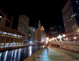
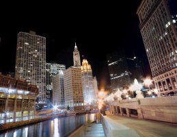
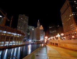
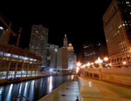
Here's a picture I really like. The colors are interesting and I like the basic scene itself. I hit the exposure of the lamps on the left just about perfect (for my taste ), but the blown out highlights on the street lamps to the right just wrecked it (well that and the slight light flare at the top :) ) . The lamps on the right are blown out so hard I can't find a way to save this one. :bang: This is probably a case where I needed to take two very different exposures and then merge them together in PS. :think:
 

Attachments

  • River_0543_DRN.jpg
    River_0543_DRN.jpg
    163.5 KB · Views: 227

Thump

Jr Admin Type
Jan 17, 2000
4,656
7
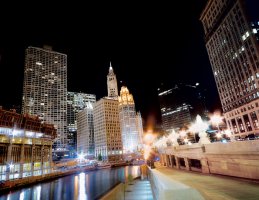
Very few images are unsaveable. I work with some of the best photogs in the industry and never get "from the camera perfect" images. My suggestions.

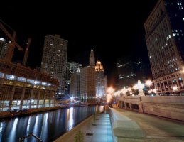
Step 1: Crap removal and tone down acidic lighting on right side of image.
 

Attachments

  • s1.jpg
    s1.jpg
    134.7 KB · Views: 223

Rich Rohrich

Moderator / BioHazard
LIFETIME SPONSOR
Jul 27, 1999
22,839
16,904
Chicago
I liked the cup in there, but I'm pretty sure I have a shot without it. :)

After seeing the cup removed and the rightside rail missing, it does look better.
I liked all the changes except 3 & 4. I think the original contrast and lighting of the far center buidlings looks better, and the crop kills the scene. Without the railing and the edge of the stone pillar you lose the near, middle, far references. The perspective seems out of whack without them. :whoa:

I think Bob is right. You did an amazing job of cleaning up my mistakes, but the blowout on the lights on the wall is death. :(


That's why I think this stuff is so much fun. It's all open to interpretation. :)
 

Rich Rohrich

Moderator / BioHazard
LIFETIME SPONSOR
Jul 27, 1999
22,839
16,904
Chicago
Thump said:
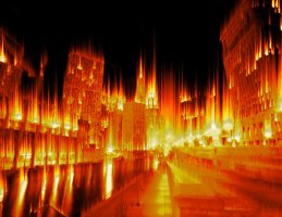
Or just burn it down. :yikes:

That looks really cool. :p

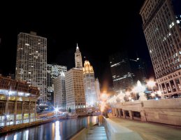
I tried to mimic some of the things you did (except for the cup and rail trick :) )
 

Attachments

  • River_0543_b_DRN.jpg
    River_0543_b_DRN.jpg
    134.5 KB · Views: 168

Rich Rohrich

Moderator / BioHazard
LIFETIME SPONSOR
Jul 27, 1999
22,839
16,904
Chicago
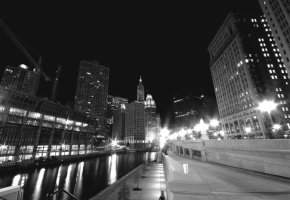
Here's another one from the same series with similar problems. For me it's a little easier to hide flaws when it's black & white. :) It looks a lot brighter on the left at full res. :|
 

Attachments

  • River_0544_B_BW_DRN.jpg
    River_0544_B_BW_DRN.jpg
    150.3 KB · Views: 173

Kawidude

D'oh!
LIFETIME SPONSOR
May 23, 2000
1,386
0
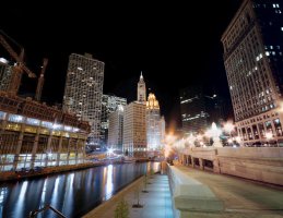
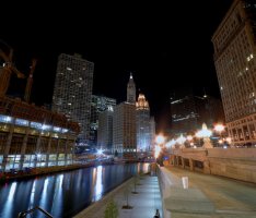
Here's my quick "hack" attempt. Removed the cup and rail, lightened up the right side a tad and brought down the intensity of the lamps a little. Not sure I'm really happy with the lights though.
 

Attachments

  • Richs river copy.jpg
    Richs river copy.jpg
    123.1 KB · Views: 163

Rich Rohrich

Moderator / BioHazard
LIFETIME SPONSOR
Jul 27, 1999
22,839
16,904
Chicago
Kawidude said:
Not sure I'm really happy with the lights though.

That's the problem I ran into. Any attempt I made to tone them down just made them look wrong in a "different" way. I guess the moral of the story is, don't blow out the highlights. :whoa:

I'm going to try and learn the two picture, two different exposures merge trick, and then go back and shoot in this area again.

Thanks for the lessons Thump.:cool:

I have to go read up on the disappearing rail trick now. That is COOL.
 

Kawidude

D'oh!
LIFETIME SPONSOR
May 23, 2000
1,386
0
Rich Rohrich said:
That's the problem I ran into. Any attempt I made to tone them down just made them look wrong in a "different" way. I guess the moral of the story is, don't blow out the highlights. :whoa:

I'm going to try and learn the two picture, two different exposures merge trick, and then go back and shoot in this area again.

Thanks for the lessons Thump.:cool:

I have to go read up on the disappearing rail trick now. That is COOL.

I'll give you a hint on the disappearing stuff...check out the "clone" tool. Stuff like that will become pretty easy when you figure out the best areas to pull your source from in order to fill in/cover what you don't want.
 

Rich Rohrich

Moderator / BioHazard
LIFETIME SPONSOR
Jul 27, 1999
22,839
16,904
Chicago
Kawidude said:
I'll give you a hint on the disappearing stuff...check out the "clone" tool. Stuff like that will become pretty easy when you figure out the best areas to pull your source from in order to fill in/cover what you don't want.


COOL, thanks. :cool:
 

Green Horn

aka Chip Carbone
N. Texas SP
Jun 20, 1999
2,563
0
Amazing stuff! You ALL have PS skills I am working towards. :)
 

Green Horn

aka Chip Carbone
N. Texas SP
Jun 20, 1999
2,563
0
Rich Rohrich said:
I liked the cup in there. :)

C'mon now Rich. I'm a total noob but even I know to set my beer down OUT of the pic when taking it. :laugh:
 

sick 96 250

Damn Yankees
Member
Jul 16, 2004
1,207
0
Imust say that is some pretty cool stuff, I do a lot of photoshop but its more with cars and such and not nearly as technical as this stuff. I think I need to start practicing a little more, very cool stuff
 

Rich Rohrich

Moderator / BioHazard
LIFETIME SPONSOR
Jul 27, 1999
22,839
16,904
Chicago
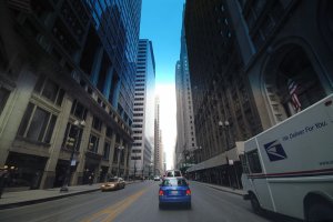
Here's another one with exposure requirements that were pretty wide. I metered on the reflection of the blue sky and building to the left and blew the highlights (and the color) out of the center. I was driving down Lasalle at the time but that hardly seems like an excuse. :whoa:
 

Attachments

  • Lasalle_NB_130_DRN.jpg
    Lasalle_NB_130_DRN.jpg
    125.2 KB · Views: 114

Kawidude

D'oh!
LIFETIME SPONSOR
May 23, 2000
1,386
0
Did you add the blue gradation at the top? Or is that just in the shot? Or could that be the blue strip across the top of your windshild?

I'm not sure if you've already posted the info in another thread, but what lens are you using for these city shots? I really like the way they look.
 

Rich Rohrich

Moderator / BioHazard
LIFETIME SPONSOR
Jul 27, 1999
22,839
16,904
Chicago
Kawidude said:
Did you add the blue gradation at the top? Or is that just in the shot? Or could that be the blue strip across the top of your windshild?

The way it breaks clean I would guess it's from the top of the windshield. I was driving slow and trying to point the camera so I must have missed it. I should have shot from a lower position and metered on a brighter section of the scene to keep the center highlights intact. At least then I could have tried to recover the shadow areas instead of having the center blown out. :bang:

Kawidude said:
I'm not sure if you've already posted the info in another thread, but what lens are you using for these city shots? I really like the way they look.

I'm using a Sigma 10-20mm f/4-5.6 EX DC HSM Lens. It has an angle of view 102.4 ° at 10mm and 63.8 ° at 20mm.

I looked at the Nikon 12 - 24 mm f/4 as well. It it costs twice as much as the Sigma and at my skill level I could never realize the potential advantages in the more expensive Nikon glass.

Tokina has a really nice 12 - 24 mm f/4 for about the same price as the Sigma. I liked it when I looked at it, but the Sigma went wider so I went that way.

Real photographers insist on the Nikon glass, but the Sigma takes great pictures and it's a ton of fun, which for me is the whole point anyway. :cool:
 
Last edited:

Kawidude

D'oh!
LIFETIME SPONSOR
May 23, 2000
1,386
0
That looks like a great lens. A quick look on-line shows that it's actually received some awards for its quality. I need to start saving the pennies!
 
Top Bottom