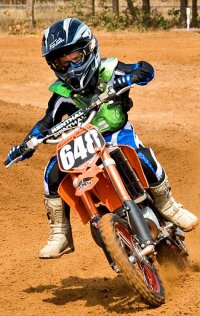
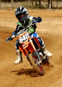
The little guy
- Thread starter Okiewan
- Start date
You are using an out of date browser. It may not display this or other websites correctly.
You should upgrade or use an alternative browser.
You should upgrade or use an alternative browser.
Dave_panda
Mod Ban
- Aug 4, 2006
- 18
- 0
wait rest in peace is that joke that sucks
- Thread starter
- #10
Yup. Seems like if I don't imbed a profile they look better, but I'm on a Mac, the browser see's the color correctly no matter the color profile. I've yet to figure out what causes some images to display poorly.Chili said:Convert from Adobe RGB to srgb for web posting? The KTM colors look whack to me but could be this POS monitor at work.
The first KTM (posted today) looks right to you or no?
The Kawi?
- Thread starter
- #14
Better? Having a hard time with this one. It was shot in raw, pretty sure those earlier versions were imported in AdobeRGB, then converted to sRGB. This time, sRGB right from raw. I work with AdobeRGB for all my other stuff, probably forgot to change over.
Attachments
- Thread starter
- #16
Couple things have me stumped, including these color issues for web display.
Some images, even though they are sized the same (px and dpi) require a lot more compression to get to the file size limit than others of the same batch? I've yet to figure that one out.
Do you guys convert to a profile or assign a profile before saving? (I typically shoot in AdobeRGB to get the larger color gamut then convert for the web)
Okie said:Better?
Nope.
Okie said:Do you guys convert to a profile or assign a profile before saving? (I typically shoot in AdobeRGB to get the larger color gamut then convert for the web)
I shoot sRGB, don't convert or assign anything. PS is set to use my Labs printer profile for soft proofing but other than that I don't assign profiles.
- Thread starter
- #19
Okay, the new versions (on the mac display) are much more saturated. I know the mac manages color a lot better (PC browsers don't at all from what I understand. If I shoot in Adobe and post it, it looks great, on the mac (more color to work with).
In the second set, I saturated and used selective color to make the orange pop (to the point of over sat on this display. I'd be curious to see what thump thinks they look like?
Something is getting hosed in the conversion, but no effecting other colors? I give up on KTM's :)
In the second set, I saturated and used selective color to make the orange pop (to the point of over sat on this display. I'd be curious to see what thump thinks they look like?
Something is getting hosed in the conversion, but no effecting other colors? I give up on KTM's :)
Okie said:I give up on KTM's :)
Now you sound like Rich :laugh:
- Aug 29, 2004
- 2,958
- 0
FWIW from a photo-illiterate the front plate and topside fender are worse than underside fender and insides of shrouds, some point they are going to start looking on the pink side of shading
windowsxp
laptop 1024*768
96 dpi
32bit color
last pic was an improvement though
windowsxp
laptop 1024*768
96 dpi
32bit color
last pic was an improvement though
Similar Topics
P
- Replies
- 0
- Views
- 170
P
R
- Replies
- 0
- Views
- 134
R
- Replies
- 0
- Views
- 298
R
- Replies
- 0
- Views
- 257
R
FRESH VIDEO
-
Tate Reed is Back on the Bike!
Sat, 16 Nov 2024 13:00:03 CST
-
Going Back to Our Roots! Tate Reed Injury Update
Wed, 13 Nov 2024 16:43:22 CST
-
Cooper Webb on Offseason Racing, Choosing Fly, 2025 Expectations & More
Tue, 12 Nov 2024 14:00:06 CST
-
Recalling McGrath & Stewart Days… | Brian “Big B” Barnhart & Tim Ferry on the SML Show
Tue, 12 Nov 2024 13:00:17 CST
-
PulpMX Show 605 – Cooper Webb, Mitchell Oldenburg & Michael Leib w/ Blair, JT & Armsby in Studio
Mon, 11 Nov 2024 09:56:58 CST
-
Supercross Racing ON THE BEACH??
Thu, 07 Nov 2024 15:00:26 CST
-
Team Announcements are Rolling In | Lewis vs. Kellen: More Than Moto Ep. 36
Thu, 07 Nov 2024 10:20:25 CST
-
Fly Signs Webb! JT on How Deal Came Together, Explains How Gear Companies Budget Pro Riders
Tue, 05 Nov 2024 15:44:32 CST
-
Insight on Testing for Jett Lawrence & HRC Honda… | Trey Canard on the SML Show
Tue, 05 Nov 2024 13:00:19 CST

