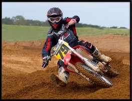
Which one is better .. everyone vote :)
- Thread starter Okiewan
- Start date
You are using an out of date browser. It may not display this or other websites correctly.
You should upgrade or use an alternative browser.
You should upgrade or use an alternative browser.
B
biglou
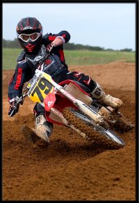
It's a tossup for me. I tend to favor landscape over portrait, generally speaking. I could see this one cropped tight on the bars/helmet/eyes area, also.
- May 23, 2000
- 1,386
- 0
I voted for number 2. I might have cropped just a tad looser on the sides, but I always like getting in close on the rider and bike. They're both great, but I like seeing the little details you pick up when stuff is cropped a little tighter like the second shot.
- Thread starter
- #6
Like will says "It's not dirt, it's choclate cake."mdkuder said:I like to see more of the track and that dirt looks sweet.
nikki
Moto Junkie
- Apr 21, 2000
- 5,802
- 1
I can't pick. I see benefits to both versions.
1 - fits very nicely on the pc screen (like for a screen background), has a nice clean background (doesn't get much cleaner, LOL), this version would be good for more of a track website shot or something for the track.
2 - great rider shot for the rider like to print & frame, see more detail/larger image of rider in the sizes you posted, good for like a mag article featuring the rider, and I tend to crop to the rider similar to this in my own mag/web shots.
I like the second one better as it fills up the pic.The first one is good tho as it is in the "one third" of the frame. I would have to say its preference over talent. You are getting really good Okie,you better be careful you might have found another career.
I voted for the first one because I like a bit of space. I also like how the bike/rider is further to the right, leaving space to the left for him to ride into.
As far as other things go, that shot looks exposed perfectly. There is still detail in the black, and the whites are barley blown at all. The only thing to make that shot any better is to add 3000 people behind him cheering him on.
As far as other things go, that shot looks exposed perfectly. There is still detail in the black, and the whites are barley blown at all. The only thing to make that shot any better is to add 3000 people behind him cheering him on.
rm_racer
Member
- Mar 15, 2005
- 501
- 0
Nice shot.
I picked the second one for 2 reasons.
1) The tighter crop makes the effect that there is more action in the shot. With the first crop, the action was all to one side and the left side was kind of empty.
2) The second crop has a bit more detail due to the extra size because of the cropping I am guessing.
If he had been a bit further into the corner, taking up more of the picture, I probably would have picked the first one.
- Nov 7, 2001
- 1,234
- 0
#1 - Just enough background to give a little perspective. After seeing the 1st the 2nd seems like its missing something.
- Thread starter
- #18
Bah! It's just a camera phone :pand the clarity is AMAZING.
Thanks for the kind words.
Thanks to everyone for the comments. Been an interesting "test" for me and actually came out just about like I thought it would (majority liking the landscape). Sometime I'll post why I think that is.
Jon K.
~SPONSOR~
- Mar 26, 2001
- 1,354
- 4
I gotta pick the first one.
For an action shot to work, there has to be context. Take out the context and it is just a pretty motorcycle.
Sort of like the TV coverage the they sometimes do of simply following a bike around an MX track. The racing is lost if we can't see the track, and the other competitors.
For an action shot to work, there has to be context. Take out the context and it is just a pretty motorcycle.
Sort of like the TV coverage the they sometimes do of simply following a bike around an MX track. The racing is lost if we can't see the track, and the other competitors.
I would like seein the first one so that I can tell more of the teritory, what situation the riders facing = a realistic picture. the second looked to have more intensity on the rider, more of what you can find in the magazine hype. thou I did see a kdx 200 blasting throu th trails on an offcamber single track wheelie appearing to go another 75 feet in a magazine.
Similar Topics
- Replies
- 17
- Views
- 3K
FRESH VIDEO
-
PulpMX Show 582 – RJ Hampshire, Evan Ferry, Phil Nicoletti & Donnie Emler Jr w/ Stephenson & Ginolfi
Sun, 21 Apr 2024 22:26:03 CDT
-
Weege Show: Nashville Supercross And The Pocket Square
Sun, 21 Apr 2024 01:04:26 CDT
-
Weege Show Nashville Supercross 2024 Preview
Fri, 19 Apr 2024 17:05:18 CDT
-
Nashville PulpMX Fantasy Preview & Strategy | Before You Pick! 2024 ft. RotoMoto
Fri, 19 Apr 2024 16:47:04 CDT
-
Supercross betting is here! PulpMX Fantasy is teamed up with BetOnline to add some fun to the races!
Fri, 19 Apr 2024 10:04:41 CDT
-
How To Install the BBR Rear Shock Spring on a Honda CRF110F
Fri, 19 Apr 2024 08:23:00 CDT
-
Bike Control Master Class!! Learning Proper Techniques with Chad Reed
Thu, 18 Apr 2024 18:17:52 CDT
-
Fly Racing Moto:60 Show – Nashville SX 2024 with Dan Truman & Zach Osborne
Thu, 18 Apr 2024 14:14:48 CDT
-
Showdown: Does The West Have A Better Roster Than 250 East Heading Into Nashville SX?
Thu, 18 Apr 2024 11:00:40 CDT